Monday, 30 April 2012

Horror Poster Analysis - Tyler Mason

As part of our project we also have to create a horror poster to advertise our film.The poster above was used to advertise popular film saw.After looking at various posters I have noticed that they are generally very simple and show a key feature of the film for example saw is known for is graphic killings and mutilation so to support this they have used an image of a mutated foot on the poster. The image is very simple but it still sends chills down your spine as your left wondering whose foot it is.The back ground colour of the poster is white which goes against of the convention of other horror posters which are usually black or a dull colour.How ever the use of white is very effective as it brings out the trickled blood and makes it visible.The background also enhance the image of the foot as it makes all the bruises and cuts on the foot stand out. The fact that we are only shown a foot and nothing else creates element of suspense.On the top of the image we can see and outline of a saw, which is a play on words with the films title.The image also suggests that it was that saw that mutilated the foot.
At the bottom of the page we find the credits. In comparison to the rest of the text on the page the writing is very small and not at all visible unless your close to the poster.This is done so the text does not take your focus away from the main image.
Below the credits are logos of the companies involved with the production of the film.Both the logos and credits are a musky white colour so from a distance they fade into the background but up close they are visible.
To conclude I have learnt that the key to making an effective poster is to make it as simple as possible so it creates and element of suspense which in affect should generate fear into the viewers of the poster.

textual analysis of horror poster conventions (kieron)

Evaluation of the design of horror film posters


I have chosen the horror film posters below because they all have a similar style of design and layout. The top four are the most similar in design in that they all use the same convention of a black background with the subject dramatically lit from above highlight certain feature to create a feeling of fear or terror. The top two posters are the most comparable in design because both subjects fill the top half of the layout and are lit from a certain angle to conceal the bottom half of their faces and highlight their eyes this creates a dramatic effect. Both of the posters have their titles at the bottom of the page and use red and white typography and state the films directors and actors beneath the title, the font design of both film titles reflects the content of the film for example ‘Mirrors’ has a mirrored R in the middle of the title and ‘Rec’ is base of the design of a recording symbol as found on the video camera. The main difference between the two is that ‘Mirrors’ does not have a tag line where as ‘Rec’ does and also has some information place in the top right hand corner.


The film posters for ‘Scream 4’ and the ‘The Descent’ use similar conventions to the films above in that the use a black background with a face as the main subject, the lighting is used for dramatic effect and the film titles and information are at the bottom of the page and use a white font. I have chosen these two posters because they both have images that have been manipulated to suggest what the content of the film might be for example the mask in ‘Scream 4’ has been digitally manipulated to become a knife this is the famous murder weapon from the Scream series and shows the audience that the mask and the knife will be a central theme to the film. The image in ‘The Descent’ has used lighting to represent what the film might be about, the light is made to look as if it is seeping through a crack in a rock this gives the effect of being trapped underground.

These posters use less of the same convention as the others; they still have a close up on the subject and the title at the bottom. ‘Shutter’ uses a background of what looks like a digitally composed collage of photos and imagery instead of a conventional black background, the montage of photos have been put together to create a human skeletal creature. ‘Quarantine’ have a close on a woman reaching for help but a night vision filter has been placed over it. ‘Quarantine’ also has the most writing as the designer has put a story at the top left of the poster.

Textual Analysis Of An Existing Horror Poster - Shaquile

Saw IV, Released: 2007
 Director: Darren Lynn
Bousman
Producer:  Mark Burg Production/financing Company: Evolution/Twisted Pictures
Actors: Tobin Bell Costas Mandylor Scott Patterson Lyriq Bent Betsy Russell
Films Origin/Info: 4th film out of a 7 film franchise
Synopsis: The Police find Detective Kerry dead and the SWAT commander Rigg is traumatised with the mutilated corpse, although he is traumatised he adamantly persists to save Detective Eric Mathews that has been missing for six months but unfortunately Hoffman asks Rigg to take a vacation and leave the case. SWAT Commander Rigg is then abducted and thrown into a new game; he is the last surviving officer who has 90 minutes to complete some blood curdling tasks in order to save his old friend or face death. The main Protagonist Jigsaw and his apprentice Amanda are also now dead. During Jigsaw’s autopsy a video tape is found in his stomach. John Kramer the Coroner calls Detective Hoffman. Detective Hoffman alongside Agent Strahm and Agent Perez join Hoffman’s team to investigate the legacy of jigsaw.
This poster denotes a long shot of a lady in a dark room, sitting on what seems to be some sort of torture chair wearing high heels and a swine mask. There are many connotations associated with the Pig, in ancient Chinese culture the pig was seen as a sign of virility, strength and fertility, however providing the context in which this pig is used; there are also some negative connotations which are more relevant to the conventions of horror, in Islam the pig is seen as sloth and impure, thus it is forbidden to eat. The idea of the pig being forbidden gives the image connotations of danger, which is appropriate to the conventions of horror to be dangerous and cause fear. Moreover, the main prop, the torture chair, otherwise known as the Judas chair which was used in medieval times as a method to derive a confession or information from the victim equally has negative connotations of death, its main strength was the psychological fear it evoked on potential victims.
The woman in the image is wearing a red cloak; the colour red has some negative connotations such as guilt, sin, passion and anger, blood and sacrifice. In the context of this particular poster, abstract nouns such as sin, anger and sacrifice are the most relevant to horror as they are in the semantic field of death. On the contrary, red also represents promiscuity; it is evident that in this poster some of the costume worn by the antagonist also has connotations of promiscuity. The sexual innuendo connoted with High heels makes them extremely symbolic for female domination, the phallus and erotica.
The antagonist has a hidden identity, this elaborates the idea of promiscuity as the perpetrators of such sin are usually unrevealed. The only implications we get which helps to reveal the identity of the antagonist are clues derived from the high heels which connote the idea of the antagonist being female. The female can also be very symbolic in terms of horror, in medieval times females were seen as the devils advocates; species who just like the devil used their sexual advances in order to influence males to commit sin, additionally the idea of the antagonist being female also subverts from the usual stereotype that the antagonists in horror films are usually males.
The main anchorage in the image ‘Saw’  is bright red, it has connotations of blood and anger, also the font has been composed with blunt, messy edges to resemble the image of blood splatter, this relates to the genre of the horror film as ‘slasher’s’ and ‘splatter’s’ usually contain lots of graphic images of blood. The use of the roman numerals ‘IV’ help to give the text a sense of being ancient and thus it accentuates the idea of it being forbidden. The bright red colour compliments the low-key black background; it also ensures that the text is clearly visible. Additionally, the text is large and bold, also composed directly in the centre of the main image, this insures that the text is easy to establish.
The tag line ‘it’s a trap’ is situated directly under the image, it’s a declarative and so its main purpose is to inform and in this case evoke fear from the audience. Additionally, the word ‘noun’ trap emphasises the idea that that the film is forbidden. In context to the image, the antagonists right leg is shackled to the torture chair, the shackle represents imprisonment which makes a lot of implications to the storyline, the possibility that someone in the plot will be imprisoned.  The colour of the text is white which compliments the black background, the text is small and so the white ensures that the text remains clear to see.
The antagonist is situated directly in the centre of the image; this composition insinuates power and order. The composition of the image seems organized which makes the implication that the film will include some sort of organized crime.
The low-key lighting and Scratch mark graphics help to give the image a very ominous tone, it suggests the idea of savageness as the image seems dark and barbaric.
Ultimately, this poster follows most of the conventions of horror, the idea of torture and the anonymous antagonist gives the poster a sense of mystery and thriller. The use of low-key lighting, vibrant reds and whites connotes the idea of danger and fear an this is the key characteristics and purpose of horror, to summon fear.

Horror poster analysis (Nhung Pham)

The ‘Child’s Play’ horror movie poster denotes an image of a male red head doll with wounds on its face, holding a knife in an angry manner. The doll is wearing children’s clothing which is a stripy red, blue and white jumper underneath a denim dungaree. There is a spotlight emphasizing the doll’s face and the vicious emotion. The background is fully black with a red and white title and white writing below the character.


The title of the horror movie which is ‘Child’s Play’ is written boldly in a sans-serif font in white with a deep red shadow which is unusual because ‘child’ is usually combined with soft, bubbly and harmless toys or products. Therefore this immediately warns the audience it may involve children and family in a horror movie, as it is something that they could relate to it which makes it more frightening. The letters are in capital and the letter ‘P’ has a sharp edge to it which may be reminded of a knife. The colour white symbolizes innocence and purity whereas red holds connotations of death, blood, danger and aggression. The clash of colours represents a mixture of negative and positive energy coming from the title ‘Child’s play’. The title of the poster is supposed to be ironic – it is believed to be about ‘child’s play’ however it is not. Children have connotations of innocence therefore by placing ‘Child’ in a horror poster title evokes fear within the audience.

The main image placed on the right side of the poster is of a red head male doll known as ‘Chucky’ who is the main antagonist in the ‘Child’s Play’ horror film series. A doll is usually associated with children however in this poster we can see Chucky holding a knife in an angry gesture which resignifies children’s dolls. The doll holding a knife could suggest the concept of a knife would be killing and murdering therefore could be identified as a slasher horror movie as it usually contains a sharp object often a cutting tool and involving graphic images of blood.

The low key lighting with a spotlight above the dolls head empowers him and placing him as the main evil character which gives the feel of a dark, sinister power that comes from a doll. Usually, dolls are seen as a lifeless product which is now put in the spotlight which may refer to the old days where dolls were traditionally used for magic, religious rituals and possessions. Therefore with history it gives the audience a sense of mystery and the unknown of how the doll is placed on the front poster, holding a knife.

There is a review which says “excellent special effect! It packs a wallop!” placed on the bottom left below the main image. This shows that the movie has been shown and reviewed by the public which gave a good feedback therefore by including it in the poster will persuade the audience to watch the movie and find out for them selves.

Analysis Of Poster Part 2 - Tyler Mason


The other poster I reviews was the one above. The film is entitled one missed call, and the image shows a masked villain holding a phone which suggests the concept of phoning and messaging is of importance to this film.The poster follows the conventions of other horror posters and contains a black background. The background just makes everything look mysterious and generates an atmosphere of suspense and makes the image look as if it is fading away.The image has no actually face its just made up of features from other peoples faces but from the colour lips it may be that it is a female.The fact that the antagonist is a female is very unusual as females are usually seen as the hero who over comes the villain in the horror genre.
Like all other posters the credits are located at the bottom of the image how ever unlike the saw poster the credits are relatively visible and is in a write font which stands out among  the black background.

Sunday, 29 April 2012

Horror Magazine Analysis - Shaquile


The magazine front cover denotes a medium close-up shot of Pinhead, the main antagonist from the (1987) horror film ‘Hell Raiser ‘written and directed by Clive Barker. The image shows pinhead looking downwards, whilst behind him hangs multiple links of chains; moreover the antagonists head is in focus whilst the chains are out of focus. Low-key lighting is used as half of the antagonists face is secluded by intense shadow.
The masthead – the mast head is distinctive by its dog paw logo positioned on the left of text. The font of the text is in capital letters and has no flick ups which suggests the text is modern sans serif style. The colour of the text has a gradient of baby blue and blue which has connotations of loyalty, strength and faith which is interesting as it may suggest that Horror Hound magazine is a strong Horror platform that is loyal and faithful to its customers. In addition, the white shadow gives the text a 3 dimensional effect which helps the text to stand out and suggests boldness and power.
The dateline is positioned in the top right hand corner of the magazine above the masthead; although the text size is small the composition of the text ensures that the text is still visible. The dateline also reveals that the release date of this magazine is January/February 2009- this is the season of winter and explains why colours such as blue and white are used as they are associated with the season. Blue connotes the coldness and white can be associated with the colour of snow.
Main image is of a protagonist from the film Hell raiser. The Non-Verbal Communication that can be derived from this character is quite mysterious; his face is blank and emotionless like the face of a cold blooded killer. His costume is hidden, yet the only costume that is revealed is the acupuncture on the antagonists face. This costume is effective as it helps the antagonist to be distinctive. The props in this image are chains hanging vertically behind the antagonist. Interestingly, the chains could connote danger, fear or a chain of events arising from the role of the antagonist. The composition of the antagonist in this image is symmetrical; he is directly positioned in the centre of the shot. This makes the half face covered with shadow more effective implying that the antagonist has two sides of his character, specifically a dark side. The symmetrical shot denotes organisation, from this it can be implied that the antagonist is also organised and premeditates evil cunning plans to kill its prey. Sequentially, the setting of the main image demands a sense of fear as the chains resemble torture.
The font of the text is a modern sans serif type text, there are no flick ups and the text is in capital letters. This connotes the idea of horror hound being a modern magazine. The cover lines are blue whilst the small text is white. Blue and white are complimentary colours, additionally they ensures that the text is bold and that it stands out from the black background. Interestingly, black is the colour of mourning, its worn in traditional Christian funerals. Black also had connotations of sophistication and mystery; this is relevant as we are not exposed to the antagonist’s character.  
The magazine contains a standard barcode used by most retailers. The additional features of the magazine i.e. featuring movies are positioned on the left third of the cover. It contains smaller images of top selling movies and as the magazine does not have a selling line, the magazines content is what the seller will rely on in order to sell. This section of the cover also contains a cover line named (plus), which shows additional features of the magazine, in particular the titles of more movie names  and a free ‘Clive Barker’ poster included inside the product. In terms of exchange, this is effective as it creates the illusion that the customer is getting more content for their money.
The magazine issue is displayed on the magazine logo (dog paw) on the left of the masthead. The magazine cover subverts from the usual characteristics of a magazine cover as it does not have a selling line however, positioned horizontally at the top of the magazine is a list of the magazines content which directly communicates to the target audience the content of their product.
To conclude, this magazine cover may be seen as effective. It is evident that the main focal point of this magazine is commercial films, in this edition, it features films such as ‘Sweeny Todd’, ‘Alien Vs Predator’ and ‘London After Moonlight’, all top blockbuster films. The commercial film industry targets a wide spectrum of film consumers and so theoretically this magazine appeals to a wide audience. However, to improve the magazine an eye catching puff would be essential as the magazine consists of many dark colours, which blend and the puff would help to grab the attention of passers by. Additionally, an effective slogan situated under the horror hound masthead would also help to make the product more memorable and engaging for the audience.

(863 Words)

Magazine Cover Evaluation - Tyler Mason


As it is my job to create the magazine with in my group i have decided to analye various horror magazine front covers.The first one i observed was this edition of Fangoria. The page is dominated by one image. The image if of the main villan of which the magazine has featured "friday the 13th".The image takes up more then half of the cover emphazing the fact that this edition of the magazine is dedicated to this film.
After observing magazine front covers i have realized it is a convention to put the antagonist or monster on the front of the magazine rather then the hero this may be due to the genre being horror and viewers of the film would rather see how fearful the antagonist looks in order to influence them to watch the film.
The magazine Title is located at the top of the page which is a convention used by all magazine cover not just the horror genre.The font of the title is very unique and contains sharp points at the end of each letter which resembles that of knifes and other sharp object which are often seen in the horror genre. The text is also written in red,we associate this colour with danger and blood which is often used in the horror genre especially the film being shown "friday the 13th".
The barcode is located in the bottom left of the cover so it does not get in the way of any of the images or affect the colour scheme.How ever i have noticed this is not the case for all magazines,some magazine have decided to place it on the right of the page, so i guess placement of the barcode depends on the lay out of your magazine cover.
The magazine has also placed its subheading in the left of the page, similar to the placement of the barcode the subheadings do not interfer with the main image and has been section of by a border to show that it is seperate from the film friday the 13th. The sub headings vary in size suggesting that one heading may be more important then another or just to make it look more appealing to the the customer who will purchase the magazine.
There is a clear colour scheme of red and yellow being shown.The darkness of the red contrasts with the birghtness of the yellow and creates a neutral effect, colours used in the horror magazine genre tend to be dark and dull to give it that element of fear.
There are two other images on the page which are relatively small compared to the main image and are being used to support the subheadings.Both images have a embossed border around them  again seperating them from each other and showing that the two images dont relate to each other.

Horror magazine analysis (Nhung Pham)

The front cover denotes an image of four evil characters, one character looks like grim the reaper using a big wooden stick stabbing a human with horns like a devil, hung up in a form of a cross posture. Another character looks like a werewolf wearing human clothing which is all ruined and ripped, he is stabbing a young beautiful woman who is a vampire and is only wearing a bra lying in a coffin with again, a big wooden stick which is very sharp at the end. The woman has healthy brown voluptuous curly hair and pale skin with blood coming out of her chest and mouth. The masthead is on the top left under lapping the devilish character and there is a main cover line on top of the masthead. The cover lines are placed on the left side of the magazine and there is also a visible barcode on the bottom left corner.


The image of the woman, who is a vampire, is shown to be lying in a coffin with nothing but a yellow bra on. Yellow holds connotations of positive yet also negative energy. Yellow is commonly seen as happiness, intellect and wisdom however it could also symbolise deceit, betrayal and cowardice. In the context of this magazine there is a beautiful woman with a desired face and figure nonetheless she may be a deceivable and cunning as what vampires are known for, to make people fall into their charms by their beauty. Beside the vampire is a werewolf in a white, ragged/ripped shirt, turquoise trousers and a brown belt, a casual daywear costume for males. It seems that he is a human that involves into a werewolf which explains why he is in a human type of clothing. This could suggest that he is an innocent character and imply that horror is not just all about evil and bad omen.

Behind the werewolf is also the same action that is happening but instead there is a skeleton in the form of ‘the grim reaper’ stabbing a human with horns which I assume is a devil that is hung up on a cross. The fact that the devil is hung up on the cross similar to when Jesus was is ironic in the way that they are mocking him and replaced Jesus with a devil which could suggest they don’t have a belief in him as horror is associated with darkness, the devil and evil spiritual.

The horror magazine masthead is called ‘WEIRD’ in bold, capital letters. The font which has sharp jagged edges as though it is in a form of a broken knife which could represent danger as knives are usually associated with cutting and slicing things. The colour of the masthead is in red with a bold yellow outline. The colour red holds connotations of danger, power and blood. Red can attract, repel, elevate or enrage. By using red for the masthead and combining it with a sharp font shows the essence of danger but also compliments the dull, low key coloured background. This is a common convention for mastheads as they are usually placed on the left side of the magazine so that when it is stacked on the shelves the readers are able to identify what magazine it is.

The main selling line of the magazine is ‘STARTLING N’ SHOCKING TALES’ in the colour white above the masthead. White holds connotations of purity, innocence and vulnerability therefore this indicates a warning message before opening the magazine. The grammar used in the sentence such as ‘startling’ and ‘tales’ are words that would be used in children’s storybooks therefore it shows a more entertaining and fun side to the magazine, not just all gore and freaky materials that’d be expected in a horror magazine.

The cover lines are placed on the left side of the magazine in a bubble in the form of blood dripping which reverts back to the horror genre. The font of the text are fun and edgy yet have no flicks on the ends which indicates its more modernised as it tends to use more san serif fonts. The font on ‘GRAVE’ is bubbly and blood-dripping which shows that there is a fun side to the magazine and that it is not taken too seriously. The colours used are wide-ranging such as purple, red, green, yellow, white and black. The colour theme all moulds into together with the background as it contains many different colours. The different cover line which consists of one saying ‘the SPECTRE from beyond unleashes flesh-ripping terror in..‘ this catches the attention of the reader as it implies that there are gossip to be revealed and exposed from ‘beyond’ and unleashing ‘flesh-ripping terror’ the adjectives used are exaggerated which could suggest that the magazine is about horror but more about logic horror rather than about murder and killings.

The dateline and price is seen underneath the main selling line and beside the Masthead, placed on the right side of the magazine. This ensures it is visible for the readers to be able to identify the price as it is what we first look for in a magazine to see whether it is affordable. This breaks the convention as the price and date is usually found beside the barcode. It is in yellow which compliments the masthead and colour scheme and not difficult to be aware off.

To conclude, this magazine is only effective to those that are highly interested in horror facts as it shows that their main focus is on ‘vampires’ and ‘werewolves’ rather than take notice of the horror movies. Also the fact that the main image is of a devil hung up on a cross getting stabbed which is mocking Jesus Christ may offend some people therefore this magazine is aimed at those who are mostly into horror and that doesn’t take life so serious. To improve the magazine, the colours should tone down a little bit, using more darker shades or stick to a colour tone because it looks too empowering and the reader may not know where to start looking first. Overall the slogan and masthead makes it easy for the audience to identify with and unforgettable.

analysis of a magazine fornt cover (kieron)


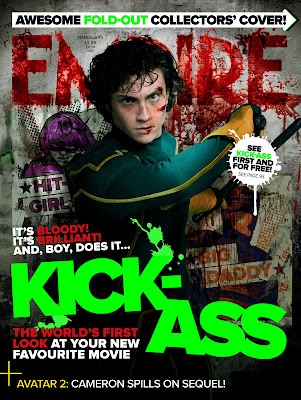
‘Empire’ magazine is the biggest selling British film magazine, out selling its rival ‘Total Film’ by two to one. Empire was originally published by ‘Bauer Consumer Media’ but it was taken over in 2008 by ‘Emap Consumer Media’ who currently publish it. Empire has also expanded to other countries such as Russia and Portugal. Empire is published monthly and normally will have the month’s biggest blockbuster film promoted on its front cover.

The denotation of this magazine is a mid shot of  Dave Lizewski the main character of the film ‘Kick Ass’ Played by Aaron Johnson, he is posing in front of a wall with posters of the other characters pasted to the wall with graffiti.

The main image of this front cover is placed in the centre of the page and has the model as the focal point; he is looking directly at the viewer making full eye contact in an intimidating/aggressive way which grabs attention to the magazine when it is in the newsstands. The model is posing in a hostile stance with his arm held up like he is about to hit someone giving us the feeling that he is not to be messed with. He is wearing a green and yellow spandex outfit as worn be the main character and clearly looks like he’s been fighting. The lighting of the model in the image is coming from the right and high lights the cuts and bruises on the his face, suggesting that this film will be violent. The model has been photographed in front of a wall covered with two posters which look like they have been painted on and distressed to resemble fly posters on a street wall. These two posters are of the two other heroes of the movie.

The image is effective in connoting the characters violent, aggressive and angry feelings that come out in the movie. The lighting and colour used in the image suggests that the film has a dark edge to it; the red in the background is like splattered blood which suggests the bloody violence in the film.

The masthead to Empire is always in the same sans serif font and is predominantly red in colour, but is often changed and adapted to encompass the genre and atmosphere of the film featured. In the case of the Kick Ass front cover the masthead has been designed to look as if it is blood splattered which breaks up the edges of the font and shows blood dripping down the wall which does not cover the posters of the other characters. Half the ‘M’ and all of the ‘P’ in Empire is covered by the characters head this is a common theme on the front covers of Empire as they are confident that the magazine logo is well known enough to not have to show all of the masthead. The dateline and year of publication and price is placed in small text at the top of the ‘M’ this is also done in every magazine.

The main cover line is ‘KICK-ASS’ which is written in a simple bold font in neon green and is the main focus of the whole magazine, by both K’s in kick there is splatters this puts more emphasis on the word kick, suggesting punching and kicking this puts more violence in the front cover. The other cover lines that draw attention are the ones above and below kick, these involve the words ‘Bloody!’ and ‘Brilliant!’ they are both in bright red so you read them before you read the sentence, it is also using alliteration which adds to the emphasis that the film in the magazine opinion is both bloody and brilliant. The cover line below starts with ‘The worlds first look at your new favourite movie’ this is in red and white, this line directly tell the buyer that it is there favourite movie, subliminally making them want the buy the magazine to see there favourite movie. At the top of the magazine there is a long arrow, within the arrow it says there is a free fold out cover inside, this makes the reader think they are getting more for there money, they also use this at the bottom by saying that James Cameron has told the magazine information on Avatar 2 which is the sequel to the 2009 blockbuster Avatar that grossed $2,782,300,000, this will help sell the magazine as many people would like to know information on the sequel.