Tuesday, 8 May 2012

3. Q4: How did you use media technologies in the construction and research, planning and evaluation stages? (kieron)

Media technologies played a big part in the making of my media product. We divided responsibilities and from my group I was left in charge of researching, designing and making the horror movie poster. The main piece of software that I used in designing the poster was Photoshop. For taking the image I used a digital camera and for the initial research I used the internet extensively.
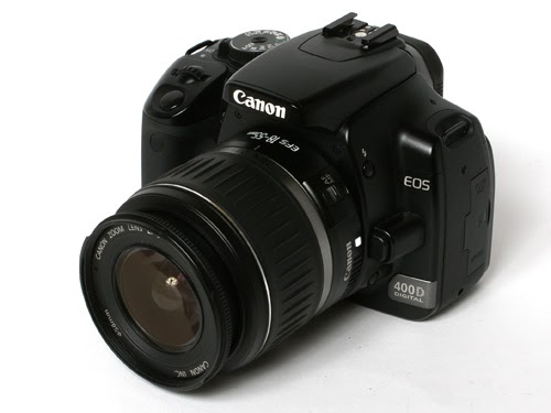


In the construction stage the first thing that needed to be done was to create a useable image for the poster. I took the photo for the image by using a Canon EOS 400D camera. This is a digital single lens reflex (SLR) camera made by Canon in 2006. It took me a little time to get used to this particular camera as I don’t usually use SLR’s to take photos. At first I had the shutter speed at a really low setting so my photo came out really blurry but I found out how to change it and got it to the right speed that would work with the aperture setting. One big problem that I had to overcome was that the image of the killer was consistently out of focus; this was because we wanted the image to have low-key lighting. We found out that the shutter speed was too low (1/6 of a second) this shutter speed will only be used in a photo where moving light would be captured, also to get an image in focus it would have to be on a tripod or on a surface that does not move. This shutter speed makes the photo to too light as well, this lead me to making the killers face a bit smaller than originally planned.

The other piece of camera equipment I handled was a Canon EF-S 10-22mm lens; This is the lens in the photo on the poster, however it was featured more for its size than for a technical reason as it was the widest one I could find and therefore allowed me the largest space to place the image of the killer.


Probably the most useful piece of software that I used in laying out the poster and am still learning about is Adobe Photoshop. This piece of software allows you to edit images. Although my Photoshop skills are quite good I was still learning new things about the extent of the software and how it can be applied. One of the new filters I learnt to use was a cloud filter, this allowed me to make my image very spooky and I used it in my poster experiments. I also learnt a lot about colour schemes and how to have colour around the text.


Another vital piece of software I use was the internet for my research; Google is a search engine that started in 1996 by Larry Page and Sergey Brin. Google images was the most useful thing about it as that’s where I could find images for inspiration, research, the conventions of horror film poster design, I was also able to compare images with my own poster design.
As well as Google I also used http://www.imdb.com/ (an online movie database) launched in 1990 by Col Needham, ‘imdb’ was good for researching film trailers at the start of the project for conventions and ideas. http://www.dafont.com/ (a font sharing website) Dafont is one of the best website to download fonts and find font, this is where I got the font (Liquid Crystal) for the title in my poster and the ‘Steel Tong’ Font for my credits.

3. Q4: How did you use media technologies in the construction and research, planning and evaluation stages? (kieron)

Media technologies played a big part in the making of my media product. We divided responsibilities and from my group I was left in charge of researching, designing and making the horror movie poster. The main piece of software that I used in designing the poster was Photoshop. For taking the image I used a digital camera and for the initial research I used the internet extensively.


In the construction stage the first thing that needed to be done was to create a useable image for the poster. I took the photo for the image by using a Canon EOS 400D camera. This is a digital single lens reflex (SLR) camera made by Canon in 2006. It took me a little time to get used to this particular camera as I don’t usually use SLR’s to take photos. At first I had the shutter speed at a really low setting so my photo came out really blurry but I found out how to change it and got it to the right speed that would work with the aperture setting. One big problem that I had to overcome was that the image of the killer was consistently out of focus; this was because we wanted the image to have low-key lighting. We found out that the shutter speed was too low (1/6 of a second) this shutter speed will only be used in a photo where moving light would be captured, also to get an image in focus it would have to be on a tripod or on a surface that does not move. This shutter speed makes the photo to too light as well, this lead me to making the killers face a bit smaller than originally planned.


The other piece of camera equipment I handled was a Canon EF-S 10-22mm lens; This is the lens in the photo on the poster, however it was featured more for its size than for a technical reason as it was the widest one I could find and therefore allowed me the largest space to place the image of the killer.


Probably the most useful piece of software that I used in laying out the poster and am still learning about is Adobe Photoshop. This piece of software allows you to edit images. Although my Photoshop skills are quite good I was still learning new things about the extent of the software and how it can be applied. One of the new filters I learnt to use was a cloud filter, this allowed me to make my image very spooky and I used it in my poster experiments. I also learnt a lot about colour schemes and how to have colour around the text.


Another vital piece of software I use was the internet for my research; Google is a search engine that started in 1996 by Larry Page and Sergey Brin. Google images was the most useful thing about it as that’s where I could find images for inspiration, research, the conventions of horror film poster design, I was also able to compare images with my own poster design.


As well as Google I also used http://www.imdb.com/ (an online movie database) launched in 1990 by Col Needham, ‘imdb’ was good for researching film trailers at the start of the project for conventions and ideas. http://www.dafont.com/ (a font sharing website) Dafont is one of the best website to download fonts and find font, this is where I got the font (Liquid Crystal) for the title in my poster and the ‘Steel Tong’ Font for my credits.

Q4: How did you use media technologies in the construction and research, planning and evaluation stages? (Kieron)

Media technologies played a big part in the making of my media product. We divided responsibilities and from my group I was left in charge of researching, designing and making the horror movie poster. The main piece of software that I used in designing the poster was Photoshop. For taking the image I used a digital camera and for the initial research I used the internet extensively.


In the construction stage the first thing that needed to be done was to create a useable image for the poster. I took the picture for the image by using a Canon EOS 400D camera. This is a digital single lens reflex camera made by Canon in 2006. It took me a little time to get used to this particular camera as I usually use SLR’s to take pictures. At first I had the shutter speed at a really low setting so my picture would come out really blurry but I found out how to change it and got it to the right speed that would work with the ISO.


One big problem that I had to overcome was that the image of the killer was consistently out of focus; this was because we wanted the image to have low-key lighting. We found out that the shutter speed was too low (1/6 of a second) this shutter speed will only be used in a picture where moving light would be captured also to get an image in focus it would have to be on a tripod or on a surface that does not move. This shutter speed makes the picture to too light as well, this lead me to making the killers face a bit smaller than originally planned. The other piece of camera equipment I handled was a canon EF-S 10-22mm lens; This is the lens in the poster, however it was featured more for its size than for a technical reason as it was the widest one I could find and therefore allowed me the largest space to feature an image.


Probably the most useful piece of software that I used in laying out the poster and am still learning about is Adobe Photoshop. This piece of software allows you to edit images. Although my Photoshop skills are quite good I was still learning new things about the extent of the software and how it can be applied. One of the new filters I learnt to use was a cloud filter, this allowed me to make my image very spooky and I used it in my poster experiments. I also learnt a lot about colour schemes and how to have colour around the text.


The most vital tool in my internet research was Google; Google is a search engine that started in 1996 by Larry Page and Sergey Brin. Google images was the most useful thing about it as that’s where I could find images for inspiration, research trends, industry conventions and also to be able to compare images to my own poster. As well as Google I also used http://www.imdb.com/ ( an online movie database) launched in 1990 by Col Needham and http://www.dafont.com/ (a font sharing website) Dafont is one of the best website to download fonts and find fonts is this is where I got the font (Liquid Crystal) for the title in my poster.

Q4 How did you use media technologies in the construction and research, planning and evaluation stages? Tyler Mason


The web 2.0 has been essential to our group in terms of gathering research and innovating ideas.
Video Site youtube has helped us come up with ideas as it allowed us to watch trailers and analyze them to full affect so we could see what we wanted to use in our trailer. As well as this it has also provided helpful tutorials on editing using final cut as none of the members with the group has had experience using it.Before we started to create out trailer we used you tube quite a lot the tutorial provided us with an idea of how we would edit the video and how we would go about doing so.Out of all the technologies used I have to say this was one of the most important as it allowed us to be creative and helped with the design for the antagonist of our trailer.How ever there was some flaws when using you tube.We found that the videos did not give us all the information we needed in terms of were to purchase equipment.For instance we got the idea of the zip face from a video tutorial via youtube how ever the video did not tell us were the equipment being used was available for purchase so we had to find out are self.
Secondly despite having a lot of videos on editing it did not have all the information we needed for example we originally wanted  a dark blue colour grade similar to that seen in Batman Dark Knight how ever it was very difficult to come across a video that showed us exactly how to do so.


Black Berry Messenger and Facebook were used in order to gather our audience research the use of instant messaging allowed us to contact people of different ages and groups instantly so we could get feed back on what they are interested in when watching a horror film.The responses they gave were then typed up and posted on blogger.I personally found the use of blackberry more efficient then the use of Facebook. This is due to the fact that Facebook seems to have died out among our age group and that who our trailer was aimed at.How ever on the BBM service it allowed us to have instant communication with people our age and we got a instant response which allowed us to get our research quickly and rapidly.As well as the speed of getting the research, it was also easy to extract the information from BBM and place it onto a computer.As blackberry has a feature called screen capture which allows you to take a picture of what ever is on the screen, you can then upload it to the computer with ease.Despite this facebook was much more use full when it came to getting feed back on our media products as it allowed people to instantly view it with out having to click to links to alternate sites.

Google has been very useful as it has allowed us to search up information on props for example the cost of fake blood and latex.It also allowed us to research directors of horror films and gain knowledge about there history and were they got there ideas from when creating films. Also we used google to research the conventions of horror which was vital in order to create our teaser trailer.As mentioned before we could not find information about the equipment via youtube so google allowed us to search for the products we needed  and showed us exactly were they could be purchased.

Monday, 7 May 2012

Evaluation Q3: What i have learned from my audience feedback on the trailer - Shaquile


Here is a list of some of the positive and negative comments made by my target audience after releasing my horror trailer...

Good feedback:
unusual title
"good documentary style"

"good transitions with static effect"

"good POV shot"

"good grading"
"good filters"

"suitable soundtrack"
"clock ticking built suspense"
"strongest point was the 'POV' shot with girl running towards fence"

Positive Criticism:

unusual title
"not sure about zoom at the end"
"too long"
"could of sped up the end"
"deeper scream at the end"


My target audience did not comment on my products genre however, there were signs which showed that they acknowledged the conventions used and challenged in my trailer. For example, someone commented about the length of my trailer, they said that the duration of my trailer was too lengthy. Teaser trailers are usually between 30 to 60 seconds and my trailer was 60 seconds. The genre of my trailer was a monster horror, there was a comment from my target audience which commented on the documentary style i used with the voice over. This feature seemed popular as it directed the audience towards the narrative of the horror film however, i tried not to give too much information away by making the voice over very vague.

There was mixed feelings shown about the horror film title '3.15'. One person commented that they did not understand the title however, another person said that although they did not understand it, they liked it. This may be because the title '3.15' is very abstract, it gives the audience no hints towards the narrative, however, the voice over clearly tells the audience that "three school students were abducted from the school gates at 3.15" and so this may imply that the target audience did not effectively listen to the voice over or that the voice over was not communicated clearly enough.

Another convention that was acknowledged was the convention of building suspense. Someone from my target audience commented that they liked the ticking sound in the soundtrack as it builds suspense. This feedback shows that the ticking sound had the desired effect on the audience that i intended. Additionally, the audience liked the static transition that i used to give off the effect of a camcorder, yet they did not like the zoom transition that i used at the end of the trailer on the antagonist. this transition was used because i did not want to show the audience too much about the film, i wanted the antagonists identity to be hidden in order to tease the audience and make them want to go and see the film.

Based on the audience feedback there are a variety of ways which i could have made a more effective product. Firstly, i would have made my trailer shorter in length as i feel that the audience were given too much footage for a teaser trailer. Secondly, i would have experimented with more horror sounds used in most trailers i.e dark synths or more diegetic sounds like screams. I probably wouldn't do another voice over because i believe that teaser trailers shouldn't reveal too much information about the narrative and my voice over did. I also would experiment with the clip speeds by using the re time feature as this was a skill that i learnt after creating my teaser trailer. Using the re time feature i would have speed up the shot of one of the students being pulled from underneath that table to give off dramatic effect, i would have also used the same feature on the last shot of the antagonist instead of using the zoom transition as this was not favoured by my target audience.

In order to accumulate more effective feedback i would have changed the way in which i promoted the trailer. my main platforms for promotion was Facebook and twitter, in future i would have used more platforms such as Bebo, Myspace, Instagram, Skype and Blackberry.In addition, i would have made an online  multiple choice poll, asking the audience what aspects of my trailer they preffered and why i.e the soundtrack, the camera shots or the grading. this is because a lot of people don't have Youtube accounts and so allot of my target audience will be unable to leave comments on Youtube as you have to have an account to leave a comment. It would have also been possible to do a written survey however, the Internet is a much faster and efficient way of promotion if you can persuade your target audience to watch your product.

internet trolls Q3 (kieron)

Internet trolls


An internet troll is a person who creates or does something usually off topic and can be offensive to another internet user or group to get an emotional response out of them. The online groups that are usually attacked are blogs, discussion forums and chat rooms. This act is known as ‘Trolling’; in the earlier days of the internet this was known as ‘Flaming’.

There are predominantly three types of trolls: ‘Mischievous Trolls’, ‘Mindless Trolls’, ‘Destructive Trolls’,

Mischievous Trolls:

A Mischievous troll will have a very small game and will not be that annoying and maybe even funnier, they have no intention to start a fight but just to be in and out with using just a picture or response.

This is an example of Mischievous trolling, a Reddit user has claimed that 4chan will always have better original content (OC), to this a group of playtime trolls have pretended to not know what OC stands for and flooded the thread with potential answers. This is not is meant to be malicious but a little bit annoying and funny.


Mindless Trolls:

Mindless trolls will write a post which will be so unintelligent that it will create a response from the user group, normally one of annoyance but can also be funny. These kind of trolls can also destroy a site, for example Yahoo Answers which was developed to ask and answer questions has been mostly taken over by mindless trolls who use it to create funny stories and questions to anger or make people laugh.


This is an example from Yahoo answers of someone who has put a ridiculous question up; because of this mindless trolling, serious questions can often be overlooked or misunderstood. These types of trolls have given birth to a new kind of troll called the anti-troll, these are trolls that troll trolls e.g. they will reply to a statement made by a troll with an even more brainless answer.


Here the troll has asked a silly question of how to win a Facebook poke war and the anti-troll has reply with an impossible suggestion to win thus shutting down the original troll. Anti-trolls are also known for making fake videos to annoy other trolls or make up a myth e.g. the Slenderman. On June 8th 2009 a paranormal Photoshop picture contest was held on the ‘Something Awful’ forum, the idea was to take a normal photo and make it look creepy and the winning picture would be posted on paranormal themed sites and blogs with full credentials. One contestant submitted two images containing a mythical being that was named the Slenderman, this was then accidently pick up on 4chan’s /x/ board and spread. On June 20th 2009 the YouTuber ‘Marble Hornets’ started to upload video’s of tapes that his friend who was being stalked by Slenderman had made, this gave ‘proof’ that Slenderman existed. This freaked out and fooled so many people including myself and is still one of the best examples of an anti-troll at work.


Destructive Trolls:

Destructive trolls can be very dangerous they will usually be in groups and target one person or a site until the site or person is forced offline. A case of destructive trolls targeting a person is the Jessie Slaughter case. Jessie Leonhardt was a micro celebrity in the StickyDrama community on YouTube known for her attention seeking behaviour. A user on YouTube made up a rumour about her to which she replied to via video, this got posted on 4chan (the home of trolls). Soon she started to get trolled by Anonymous and 4chan and she made the mistake of replying to them personally saying negative things about 4chan and its users, this led to Anonymous finding out where she lived and her phone number, this lead to her getting prank calling and things getting delivered to her house, but she kept replying to the troll and got her dad to reply which just added fuel to the fire and soon she started getting death threats, this lead to police getting involved and Jessie being not allow online for three days this only made her create an apology video.


There are a number of websites that are home to trolls, the main one is ‘4chan’. ‘4chan’ was started on the 1st of October 2003 by 15 year old Christopher Poole, 4chan is an image posting site with 52 boards. On the internet it is known as /b/ which is the name of one of its boards called ‘Random’ this is a board with no rules where a lot of trolls will plan attacks on sites. 4chan are famous for high profile trolling attacks one example of this was when they hacked into the ‘Google’ website and planted a Nazi Swastika on the hot trends page, this was there for a few hours before Google could remove it. Although 4chan are responsible for a number of these trolling events they also keep an eye on inappropriate material and have been known to ban users and give info to the police about users who act inappropriately.

I believe that trolling can be playful and funny but can also be very serious. I think that if the serious trolling leading to police investigations keeps happening that the internet might have to be regulated, yet this would stop the whole point of the internet and its freedom of speech.


Q3.What have you learned from your audience feedback? Tyler Mason

After finishing creating my horror magazine cover , I decided to get feed back from my potential audience about the product. To do so I advertised it on 3 platforms.First of all I sent a BC on blackberry service BBM and then I went on to post it on to social networking sites such as Facebook and twitter. Facebook provided the most feed back quickly and possible as it allowed the audience to see the product instantly with out having to click on alternate links and it appeared directly on the live feed so it was available to see by all my friends on facebook. It was fortunate that I had over 2000 friends on Facebook as it mean that more people were available to view the image.
One of the main criticisms I received for the magazine cover was that there was not enough images on the page and that the main image was not strong enough to stand alone by its self.I agree and disagree with this I think that it goes against the convention of a horror magazine to cluster the page with other images how ever the magazine cover could do with a bit more filling out as there is a lot of space. I think I could have added more headings and tittles and make it look less spacious.Also  I should have placed my image in the center of the page not to the left or right hand side this way it would have allowed me to add subheadings on both left and right hand side of the page and would not have put a limit on my creativity and given me much more space to work with.
A positive was that people liked the colour scheme many members of the audience felt that the colours were a good representative of the genre which is good as that means its clearly visible to people that it is a horror magazine and that is the main thing I was attempting to portray.How ever looking back on it I think I could of spent a bit more time making sure all the colours were exactly the same. For example the  colour used for the subheading "God Of War" is a brighter red then used in the other subheadings a consequence of this is that it stands out a bit to much and is very visible.I did not notice this until it was pointed out in my audience feedback. In hindsight I should have made sure all colour were the same on photo shop, how ever it was only a minor mishaps and I personal don't feel it has much affect on the final product.
Also quite a lot of people liked the use of synergy of the sub heading 3:15 having seen the poster and trailer as well they like how we used that as an icon to represent the product.Many people were satisfied with the font sizes in proportion to each other and stated that you could clearly see that 3.15 was the main focus which was the main goal so I was happy with that.
Most people seem to have liked the title and have said it looks very professional and was alongside the tag line and slogan used.